
First things first, I just want to get this out of the way but for those who are not familiar with his work, Shepard Fairey is the founder of the OBEY clothing brand and “Andre the Giant Has a Posse” street art campaign. Fairey became more widely known during the 2008 US presidential election when he created the iconic Obama “Hope” poster. Fairey’s work is known to cover a variety of topics such as social and political matters, phenomenology, and self-empowerment.
Facing The Giant: 3 Decades of Dissent was an exhibition at Over The Influence’s LA gallery featuring several select pieces from Fairey’s 30 year career alongside several new pieces.
I’m not going to lie, this is an exhibition that almost flew under the radar for me. The only reason I was able to find out about it is because I follow the Obey Instagram account and Shepherd Fairey had just posted some pictures from the exhibition’s opening day at Over The Influence LA the week before and was giving a shout out to all the people who made it out.
I know some people are thinking that it would have been better to go to this exhibition on opening day, because I’d probably see Shepard Fairey himself, and that they might have special giveaways or activities that would make the opening way better than any other day and those people are probably right. But, I’ve learned that going to an exhibition on opening day for an artist as high-profile as Shepard Fairey is going to be a clusterfuck and me trying to deal with all the chaos that is going on will just ruin my ability to enjoy the show.
I’m not saying that based on speculation, I’m saying it based on the fact that the pictures Fairey was posting on Instagram were pictures of how long the line was and also from firsthand experience. If you look further back in my art section you’ll find that I actually did attend another Shepard Fairey art exhibit on opening day. It was his Damaged exhibition at Library Street Collective. Originally, I talked my friend Tina into coming with me and for a while I was on the fence about going on opening day but then she talked me into it and it was just a horrible experience. It was a cold November night and we spent like three hours standing in line in on the street waiting to get into exhibition space before standing in line for like another four hours waiting to see the actual exhibit. In the end we ended up seeing the exhibit about an hour after Library Street Collective officially closed and even after all that, the staff was rushing people through the exhibit. I can’t blame them though, it was late, it was cold, and I’m sure they were all tired from working all night and wanted to go home. The only reason they still let us in because there were still several hundred people who had waited to see the exhibition and if they turned them all away then they surely would’ve had a riot on their hands.
The good thing about hitting up this exhibition after the opening day and I’ve pointed this out in the past in other art posts but that there were less people there which not only made it easier to take pictures of the pieces but it also made it easier to take wider shots of the gallery space and get a little more creative with my angles and framing which is something I’ve been wanting to do more of.
One thing that I really liked about this exhibition is that unlike Damaged a lot of pieces here had title cards with descriptions, and I wish I figured this out years ago but almost all the pieces were also listed on Fairey’s official website alongside their titles and descriptions. I know most amateurs would just throw pictures up without any context and just call it a day but if you’ve read my earlier rants you’ll know that I’m really trying to do what I can to set myself apart from others so be prepared to do some reading–or not. If you want to scroll through and just look at the pictures it’s not like I can force you to slow down and read, but either way if you’re seeing this page hopefully you don’t have any Ad Block plugins running so I can at least get a couple cents from your views.
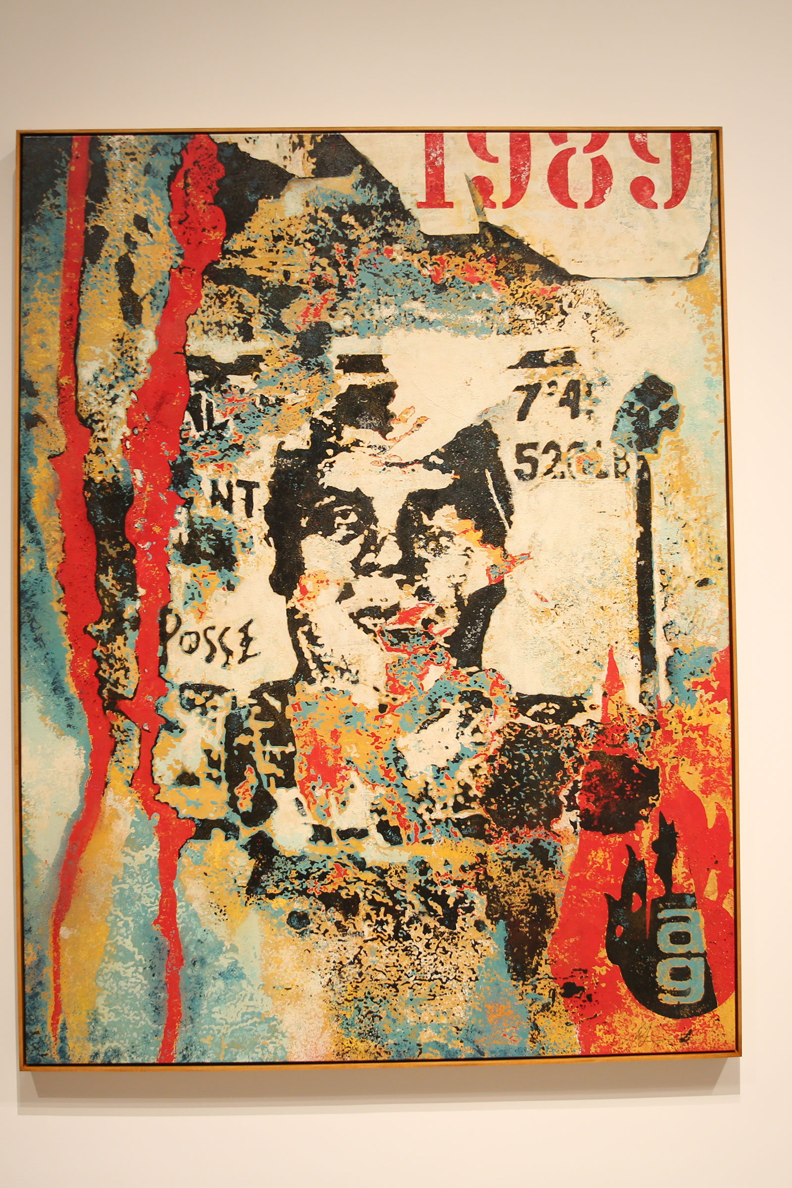
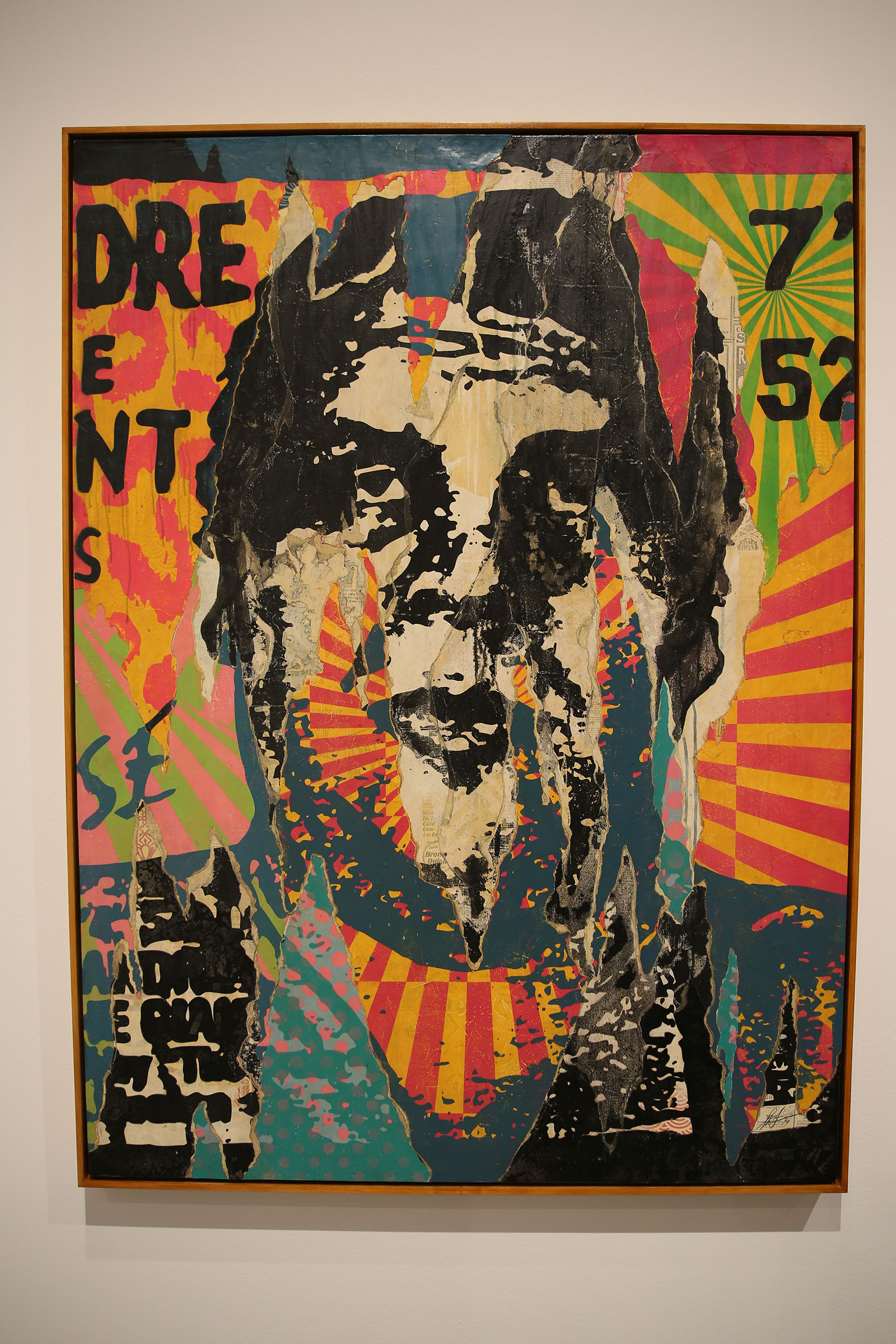
OG Rips
These two pieces which I’m assuming are titled OG Rips because of the information cards next to them. These pieces are based on the original Andre the Giant stickers that Fairey created in 1989 for his “Andre the Giant Has a Posse” street art campaign. The weathered and aged look on the pieces have two meanings. The first meaning is to represent Fairey’s 30 year career in the street art scene. The second meaning is a throwback to a time before the proliferation of the internet and social media, back when Fairey would print out physical stickers for his campaigns. These stickers would usually be posted outside or in a place where they would be affected by the elements and would quickly become worn and weathered.

Andre Psychedelic
Following the success of his original Andre stickers Fairey wanted to expand the reach of his campaign while bringing attention to his original design. Fairey tried experimenting with different patterns and colors before being drawn to the attention-grabbing color combinations used on posters for San Francisco’s historic music venue The Fillmore. The final inspiration for this piece came from John Van Hamersfeld’s 1968 portrait of Jimi Hendrix which Fairey modified by inserting Andre’s face over Jimi’s. This piece would later go on to become the first fine art screen print featuring Fairey’s portrait of Andre.

Enhanced Disintegration
Enhanced Disintegration is supposed to represent the power of tenacity and the beauty of patina and is based on one very specific Andre the Giant sticker that had been posted up on an old pole. According to Fairey the sticker had been ripped, marked on, and scratched yet still remained legible and in Fairey’s words looked “almost scarred into the pole’s surface.”

Exclamation

Obey Star
After the success of Fairey’s “Andre the Giant has a Posse” campaign Fairey followed it up by taking the original piece and giving it an Orwellian Big Brother theme the result of which became his Obey Star piece.

Obey Hammer
The “Obey Hammer is a combination of historic design elements and Fairey’s own identifiable iconography in this case imagery from Soviet-era propaganda posters combined with Fairey’s Obey Star. The use of communist-associated imagery such as this was intended to “awaken the passerby who encountered them from their daily routine.”

Obey Fist
For generations the image of a raised fist has been used as a symbol for resistance and uprising. This fist rendered in Fairey’s own iconic style is meant to be a call-to-action and inspiration for a silent but powerful protest.

Chomsky
It is said that Fairey has found a kindred spirit in philosopher Noam Chomsky whose linguistic theory showed him how language can be manipulated in deceptive ways, “arguing that politicians and big business strive to ‘manufacture consent.’ The lyrics on this piece are meant to be sung to the melody of a song by British punk rock band, The Clash. The orange arrows made in abrupt angles are meant to suggest a need to deviate from the norm in order to change the status quo.”

Lenin Money

Mao Money

Nixon Money
These 3 pieces are meant to be a commentary on wealth and political power. Fairey believes that minting money using a portrait of a leader is an “act characteristic of a totalitarian regime.” These three pieces are meant to be a “cautionary reminder, urging the public to question authority and be properly informed. Reminding us that truth and power cannot be reconciled. Those who want to control society will inevitably create fictitious narratives to do so.” The phrase on these “in lesser gods we trust,” is a modification of “In God we trust” which is commonly found on United States currency. The modified slogan is not only meant to be a commentary on the idea that the separation of church and state is a founding principle of the constitution but it is also a commentary on Fairey’s believe that many times powerful leaders are deified by the public who they will eventually betray through the corruption and abuse of their power. The use of Nixon, Lenin and Mao on the pieces is mean to be a message to the viewer that they “must not only look outside our nation for those who abuse powers but must be vigilant in our own country as well.”

Mark Art Not War
Created during the Iraq War this piece is said to be inspired by the 1960s anti-war mantra “make love, not war.” The style of the piece is said to be a reference to the Art Nouveau style used in the ’60s including on many anti-Vietnam war posters. According to the title card, “Encased within a floral garland, the female figure appears more self-assured and real rather than ethereal. The placement of two paint brushes below… not only refer to a classical tool of art production but resemble spears, which when red alongside the directive to ‘OBEY’ that appears on her neck, simultaneously makes the otherwise palatable message more pointed.”

Big Brother is Watching You
I won’t go too much into explaining the whole “Big Brother is Watching You” idea since it’s a pretty clear meaning in this technological heavy day and age and also because it’s because it’s been done to death ever since it was used in Orwell’s Nineteen Eighty-Four. This piece is meant to inspire citizens to question corporate and state surveillance as well as to remind viewers that technology has made people more susceptible to misinformation and manipulation, “raising the question, how do we take advantage of the conveniences afforded by digital technology without sacrificing our privacy and freedom?”

A Delicate Balance
This piece is a reproduction and modified version of “Earth Crisis” a public art installation that Fairey had put up in the Eiffel Tower designed in honor of the World Conference on Climate Change. The original Earth Crisis piece was a sphere inscribed with a mandala-inspired design and floral motifs and symbols representing threats to nature and reasons to respect it. For A Delicate Balance Shepard modified his original design with a blue motif to allude to the importance of sustainable clean air and water.

Downward Trajectory
This piece serves as both a visual tribute to Bauhaus design and Ed Ruscha as well as a warning about the dangers of fossil fuel reliance. The title “Downward Trajectory” is supposed to convey the message that the planet is on a downward trajectory towards destruction unless we make the transition to more sustainable fuel sources.

Revolution In Our Time(?)/Long Live The People
Originally, I thought this was just one big piece due to the proximity and juxtapositioning but after googling to figure out what they were titled and what to say about them I learned that this is actually two separate pieces. Unfortunately, I wasn’t able to confirm if Revolution In Our Time is the official title of the piece on the left but I do know the piece on the right is titled “Long Live the People.” According to my research these pieces were a collaboration between Shepard Fairey and Ed Nachtrieb, a photographer who was covering the 1989 Tiananmen Square protests and are meant to be a tribute to the students who participated in the protests.
American Rage
This piece I unfortunately couldn’t find much information on. After several hours of Googling and scouring social media the best I could find was that it is titled “American Rage” and that it was a collaboration between Fairey and photographer Ted Soqui. I believe this was a new piece which made its debut at the exhibition which could explain why I could not find that much information about it online.

Power & Equality: Flower
This piece is meant to be a call for gender equality and female empowerment. The use of actress, Rosario Dawson’s image in this piece is meant to help promote these ideals due to her involvement in organizations and causes that promote gender equality and female empowerment as well as serve as a tribute and connection to Manhattan’s Lower East Side, where Dawson grew up, a place which Fairey used as a proving ground and source of inspiration when he was a street artist in the ’90s. This is actually a companion piece to another piece called “Power & Equality: Dove” which is almost the same exact thing except the positions of the dove and flower are reversed.

Raise The Level
Unfortunately, I haven’t been able to find much information about this particular piece. According to the dates on Fairey’s website it is a fairly new piece which I’m guessing is why he hasn’t posted more information about it. All I can really tell you is that it was used as the basis for a mural in the Beats Residency space in Shoreditch, London.

End Corruption
This piece is meant to draw attention to the fact of how in our current political setting the wealthy and corporations are easily able to buy influence with policy makers and elected officials. The handshake in this picture is meant to be a symbol for the backroom deals that most corporations and government officials get into with each other, while villainous depiction of both sides of the handshake is meant to represent how these deals are done with the intention of generating revenue at the expense of the common good.

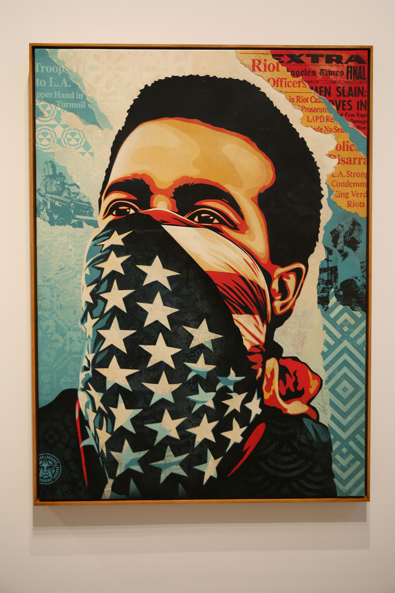
My Florist Is A Dick
This piece is meant to call to attention society’s blindness towards a rigged system and the systemic abuse of power by authority figures. The use of a police officer/soldier in riot gear is a is meant to build on a previous work by Fairey titled “I’m Gonna Kick Your Ass and Get Away With It,” a piece that deals with Fairey’s personal experiences with law enforcement officers when he was a street artist. The flower in the officer’s baton is supposed to be a metaphor for non-violent protest while the officer’s skull face under the helmet is a reference to John Carpenter’s movie, They Live starring “Rowdy” Roddy Piper. The title, “My Florist is a Dick” supposed to be according to Fairey, “an ironic statement referring to the surprise we’d feel if the local florist was a ‘sadistic asshole,’ but that we should not be surprised that ‘cops are often dicks who abuse power.”

Paint It Black
Evoking feelings reminiscent of the news coverage from the 1989 Exxon Valdez oil spill and the 2010 BP oil spill in the Gulf of Mexico, this piece is meant to address the damage the oil industry is doing to our environment. Fairey is suggesting that the oil industry is willing to continue doing damage to the world if it means they can extract as much oil as they can as cheaply as possible. The hand offering the can is a metaphor for how the oil industry uses misinformation to deny humanity’s impact on climate change.

Obey Lotus Ornament
According to the title card this piece has no socio-political meaning or messages to convey. Instead it was meant to be a cool piece that “is undeniably appealing to all.” Fairey chose to use a lotus as a symbol of hope and purity due to how most cultures consider the lotus to be a “sacred flower” due to its ability to grow clean and unscathed by the environments they grow in.

Commanda
This piece is a fictionalized caricature of Fairey’s real-life wife, Amanda, with the title serving as a verbal description of his wife as a confident and powerful figure. Fairey interprets his wife in this piece as a fierce, independent, and proactive figure in order to overturn traditional views of women in art.

Greetings From Iraq
Inspired by a postcard of Yellowstone National Park, the use of oil derricks in this piece are meant to represent Fairey’s theory of what the true cause for the Iraq War was. The imagery in this piece is a representation of former Secretary of Defense, Donald Rumsfeld’s “shock and awe” strategy during the Iraq War where they dropped large amounts of bombs across the country as a show of force, and is meant to create a comparison between the feelings Rumsfeld shock and awe strategy inspired in the Iraqi Army and the feelings observers get while watching Yellowstone’s geyser, Old Faithful go off.

Mujer Fatale
This piece is meant to be a tribute to the audacious and assertive women figures of 1960s spy films. The title “Mujer,” which is Spanish for “women” is a reference to the Zapatista movement of Southern Mexico, a group that rebelled against the Mexican government demanding indigenous rights and democracy.

War By Numbers
Inspired by a 1964 political ad for then-presidential candidate, Lyndon B. Johnson this piece asks the question, “How did war become so commonplace and banal that it seems fitting in a paint-by-numbers style image?” As an anti-war piece “War by Numbers” portrays the young girl “as both a potential victim of conflict or a possible savior for the future, capable of breaking the cycle of violence with a peaceful act.”

Proud Parents
In this piece Fairey takes an image of middle class Americans and transforms them into a “dystopian view of the American family.” The image of the family cradling a bomb is meant to be a metaphor for how American families are being consumed by a government that is more interested in the military and war instead of education.

Rose Shackle
The juxtaposition of the rose and the chain serves as a metaphor for endurance and preservation in the face of adversity as well as a message to inspire viewers to rise above oppressive circumstances.

Arab Woman
Created in 2006 during a time when anti-Islamic rhetoric and phobia was at a high point this peace is meant to convey messages of humanity and compassion towards Muslims as well as challenge preconceived notions about Muslims with its more humanized portrayal of an Arab woman.
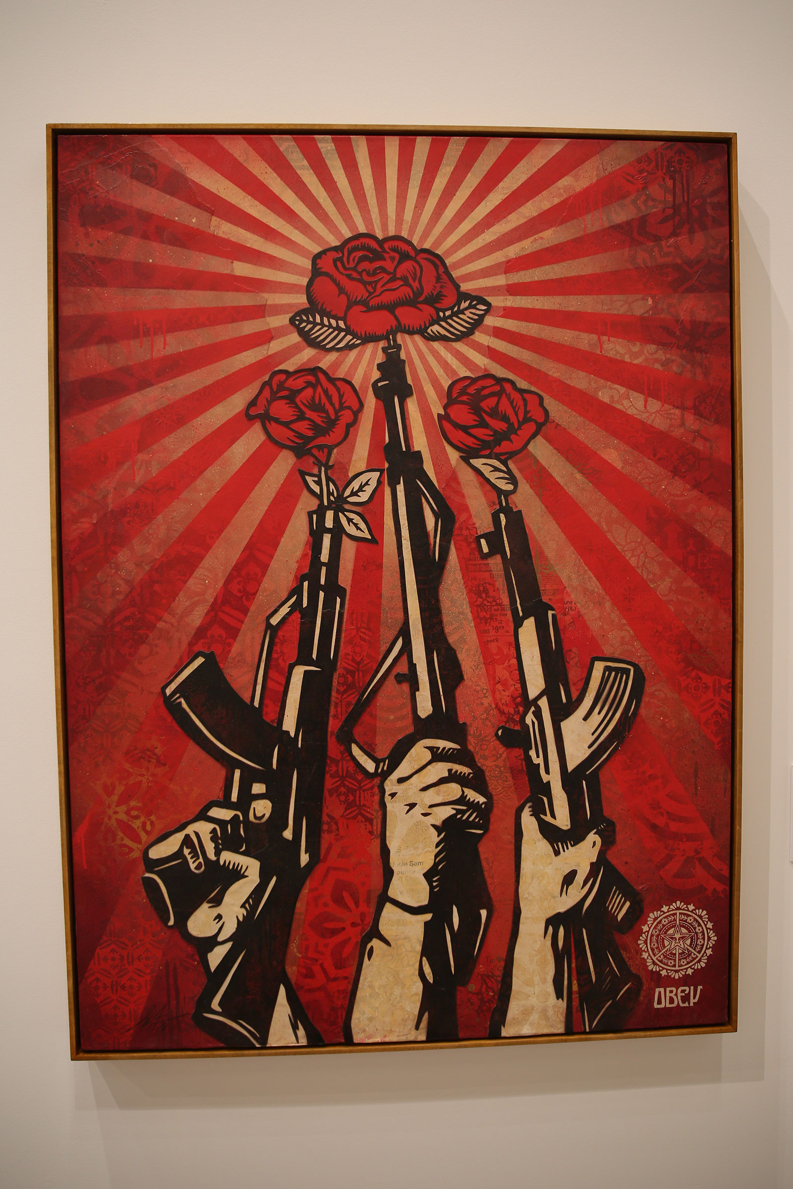
Guns And Roses
Inspired by an old Chinese propaganda poster created during China’s Great Proletarian Cultural Revolution, this piece was originally titled “Qiang ganzi timian chu zhengquan,” which translates to “from the barrel of a gun grows political power,” a phrase coined by Mao Zedong that was intended to be a call-to-action for the formation of a Community army, due to Mao’s belief that military might was necessary for gaining political advantage. Fairey takes imagery that was supposed inspire revolution in people and turns it into an anti-war message. The roses in the rifle barrels is an homage to the Flower Power Vietnam War protesters who put flowers in the barrels of National Guardsman who were sent to disperse them.


Angela/Jesse
Depicting civil rights activists Angela Davis and Reverend Jesse Jackson, Sr. these two pieces from Fairey’s Brown Power series takes African-American freedom fighters and imagery from the Black Power movement and portrays them with a Pan-African color scheme. By using unknown figures and silhouettes in the Brown Power series, Fairey was hoping that viewers would “examine their acceptance of the aesthetic of power and activism to reveal how symbolism can at times overcome the truth.”

These two pieces unfortunately did not have title cards accompanying them and I was unfortunately unable to find any information about them online so I can’t tell you what the meaning is behind them or even what their titles are.

Here’s a collage made up of photographs of the various places Fairey’s iconic Obey Giant image has been posted on.

Here’s a shot of the Over the Influence’s foyer area. I know this is only my second visit to Over the Influence but from what I’ve seen from this exhibition and the Invader Into The White Cube exhibition, OTI likes to use this big wall as a place to introduce visitors to the exhibition by displaying highlights of the artist’s work.
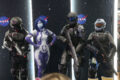
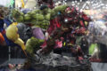
At this point I decided to gets pics of the clusters of unlabeled pieces as well as tried experimenting with my angles, trying to get wider, more creative shots of the space. While there wasn’t that much of a crowd OTI did have people coming in and out as well as security staff throughout the gallery I wasn’t able to get shots of their entire rooms like I originally planned, although I thought I did an okay job with the angles I had without accidentally getting somebody in my shots.


Thanks for checking this out and please don’t forget to come back for more.


You must be logged in to post a comment.